Education - Final Assignment
RMIT Online: UX Design
As part of my personal development, I chose to formalise my four and a half years of experience with a UX Design course through the RMIT Online. I'm including this case study in my portfolio as it demonstrates my understanding of the holistic design process and the activites involved.
We were tasked with following a hunch we had about a service that could be improved. My particular hunch was based in the lack of support for iOS devices when PTV released their Myki service for android devices. From there, I committed to desk and landscape research to ground my hunch in reality before moving onto building out a concept to test with users.
YEAR
June - July 2020
MY ROLE
UX Design
Concept design

The Hunch
Commuters struggle to complete online top-ups within the current system; due to its lack of mobile support, finnicky layout and text heavy presentation, resulting in an arduous experience for commuters on the go.
Desk Research
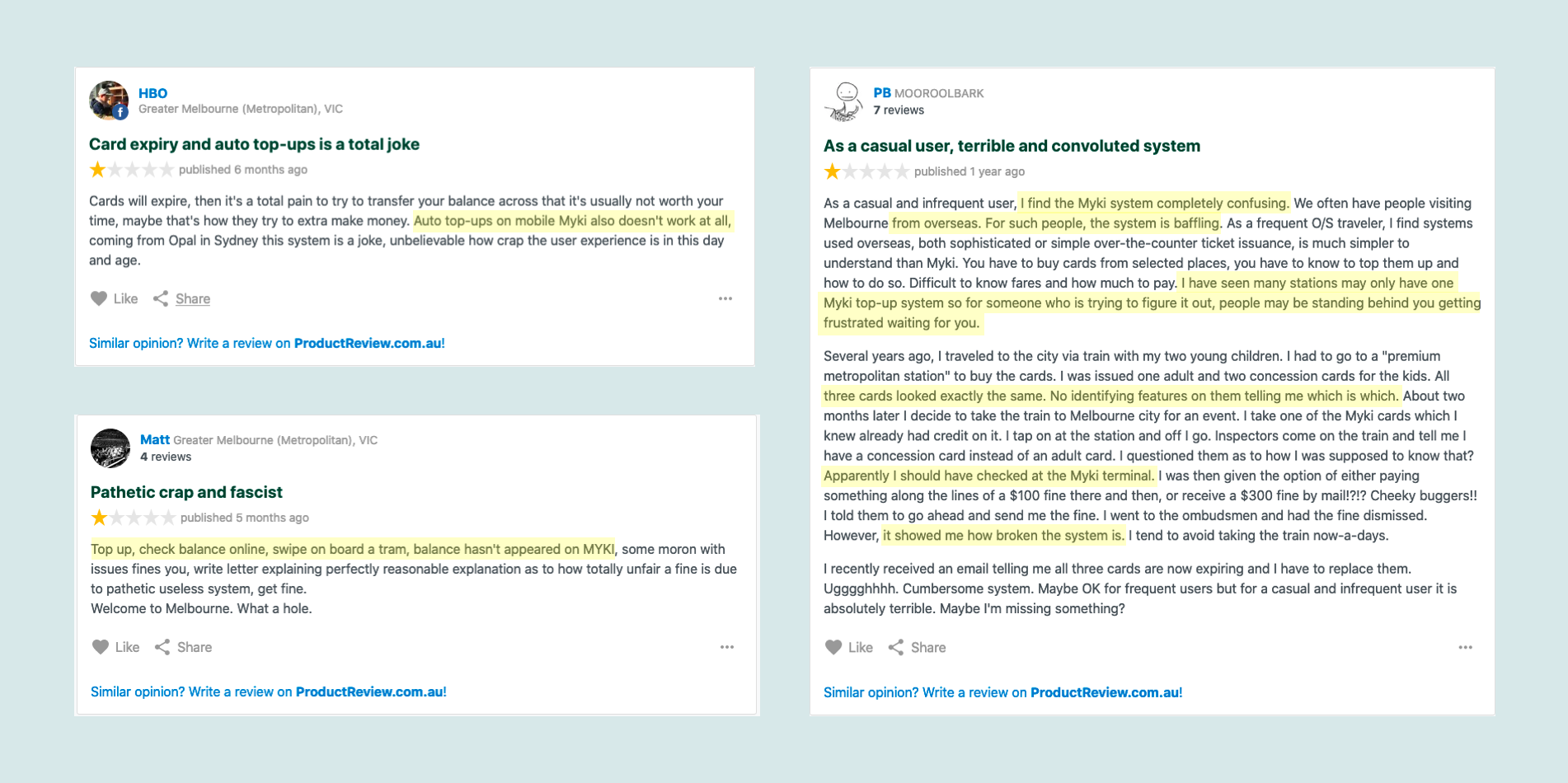
I started by doing some desk research. I wanted to determine the desirability of revising the current mobile top up flow; considering that myki presently does not have an app, and services android users through Google Pay, I went to product review to see what the general public had to say about myki.
The general consensus is largely negative with a rating of 1.3 stars across 47 veviews. I moved past the reviews that focused on staff and found that the same complaints kept reoccurring:
- The system is confusing
- Auto top-ups don’t work
- Being held up at the single terminal at train stations
- An over reliance on physical terminals to check balances & card types
It would appear that there is a want for a better system. I am aware that the android system has a decent level of uptake but some users (my colleagues) ditched the system after numerous touch-on read errors. So for my solution, I would maintain physical cards but have a mobile method of management.
Landscape Research
Transport for London have an app dedicated to topping up an oyster card; a user can view transaction history, check balances and card expiry dates, and view if you have incomplete journeys.
Japan has the Suica system; it is the highest rated service out of those I looked at; garnering praise from commuters for effective top-up balances and the ability to see real-time spending on the card (it should be noted that Suica can be used in place of dedit cards).
Sydney’s Opal system is placed in the middle; sharing similarities with Oyster and Suica. The user can top-up from their mobile device, and can view travel information, but cannot use their card for purchases.

User Testing
I ran through the current tip-up system with 4 users to gain further understanding of their experiences. Testers came from different age groups and held variying degrees of technical ability.
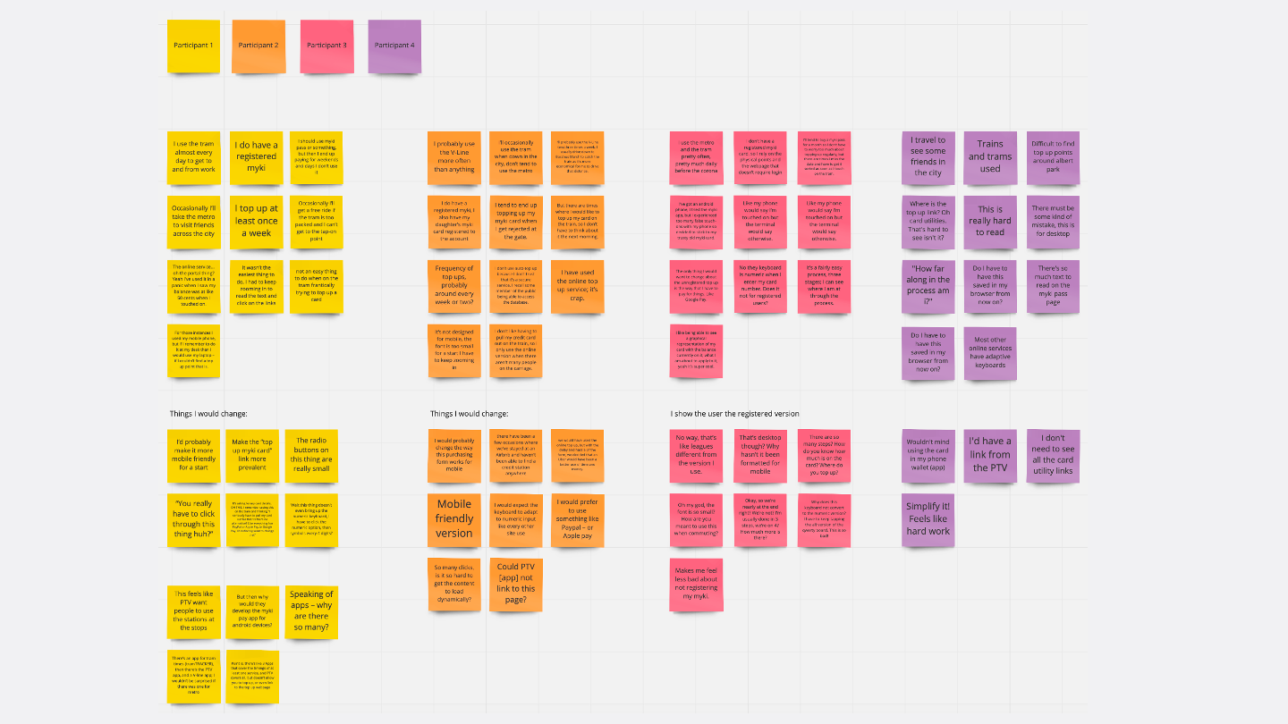
Key Insights
💡 People tend to access online top-up services on the move
Users may not live near a physical top-up point; or they are tourists and don’t know where top-up locations are; or need to top up immediately due to a low balance.
💡 Users are used to using “one-click” payment options
A mixture of Jakob's Law in effect, and concern about pulling out physical cards to finalise top-ups in public.
💡 Interviewees like to see their progress when completing a process
Complaints started to arise that the payments process was taking too long and they didn’t know how much longer it was going to take.
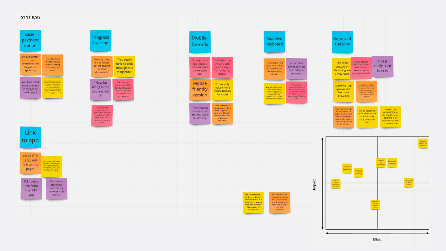
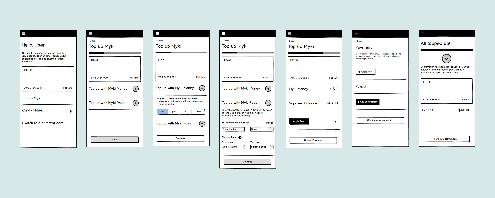
Ideation & Testing
Hey there, this is the default text for a new paragraph. Feel free to edit this paragraph by clicking on the yellow edit icon. After you are done just click on the yellow checkmark button on the top right. Have Fun!
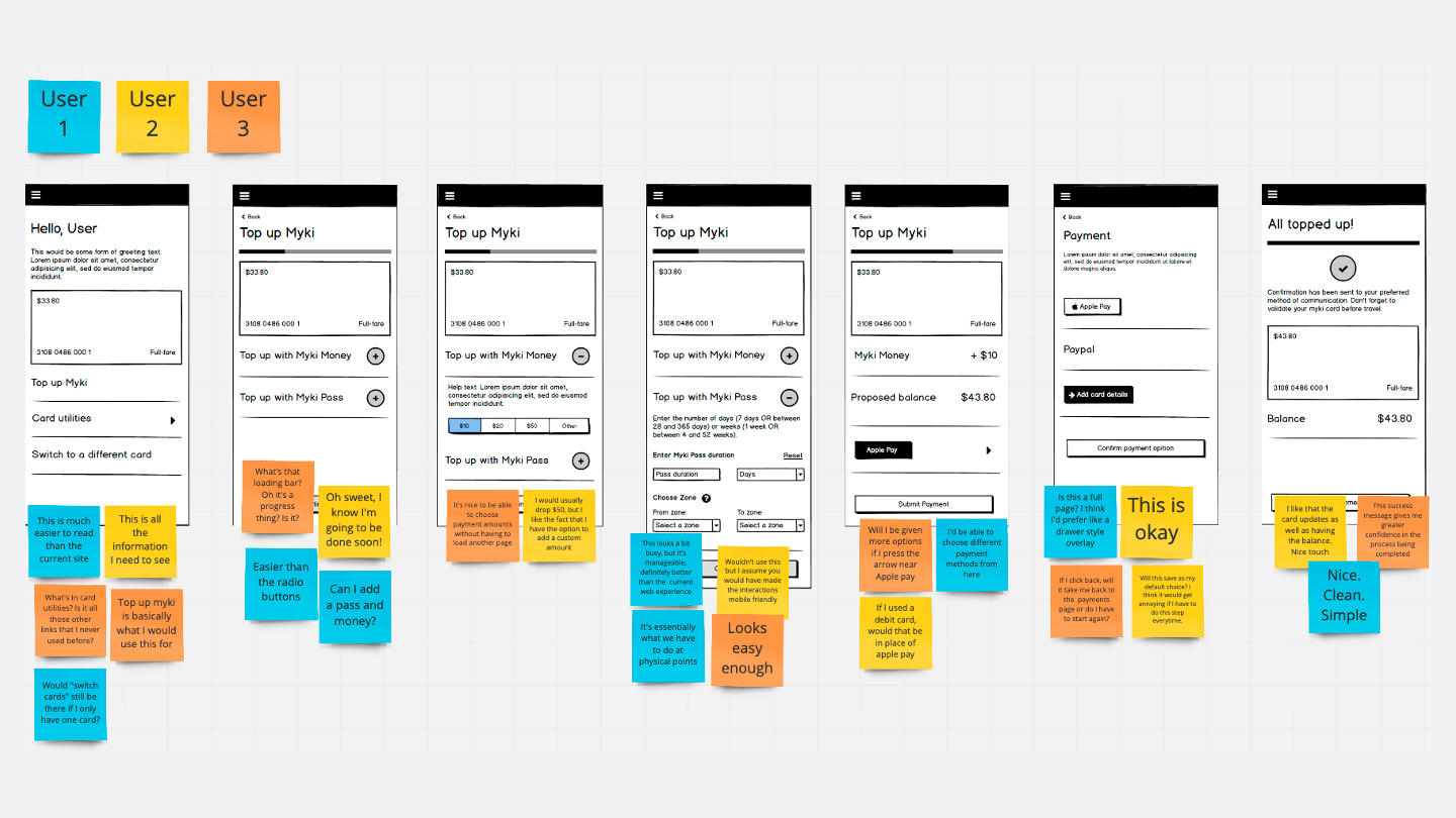
Insights From Testing
💡 Users like the simplicity of the new design.
💡 Clean up of the payment selection page to be an overlay as opposed to separate page.
💡 Progress tracker needs a redesign and apply accessibility recommendation of having ”Step X of Y”
Users mistook the tracker as a loading bar
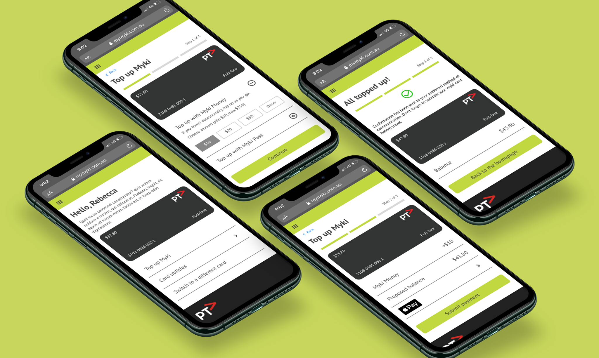
Mid-fidelity Designs
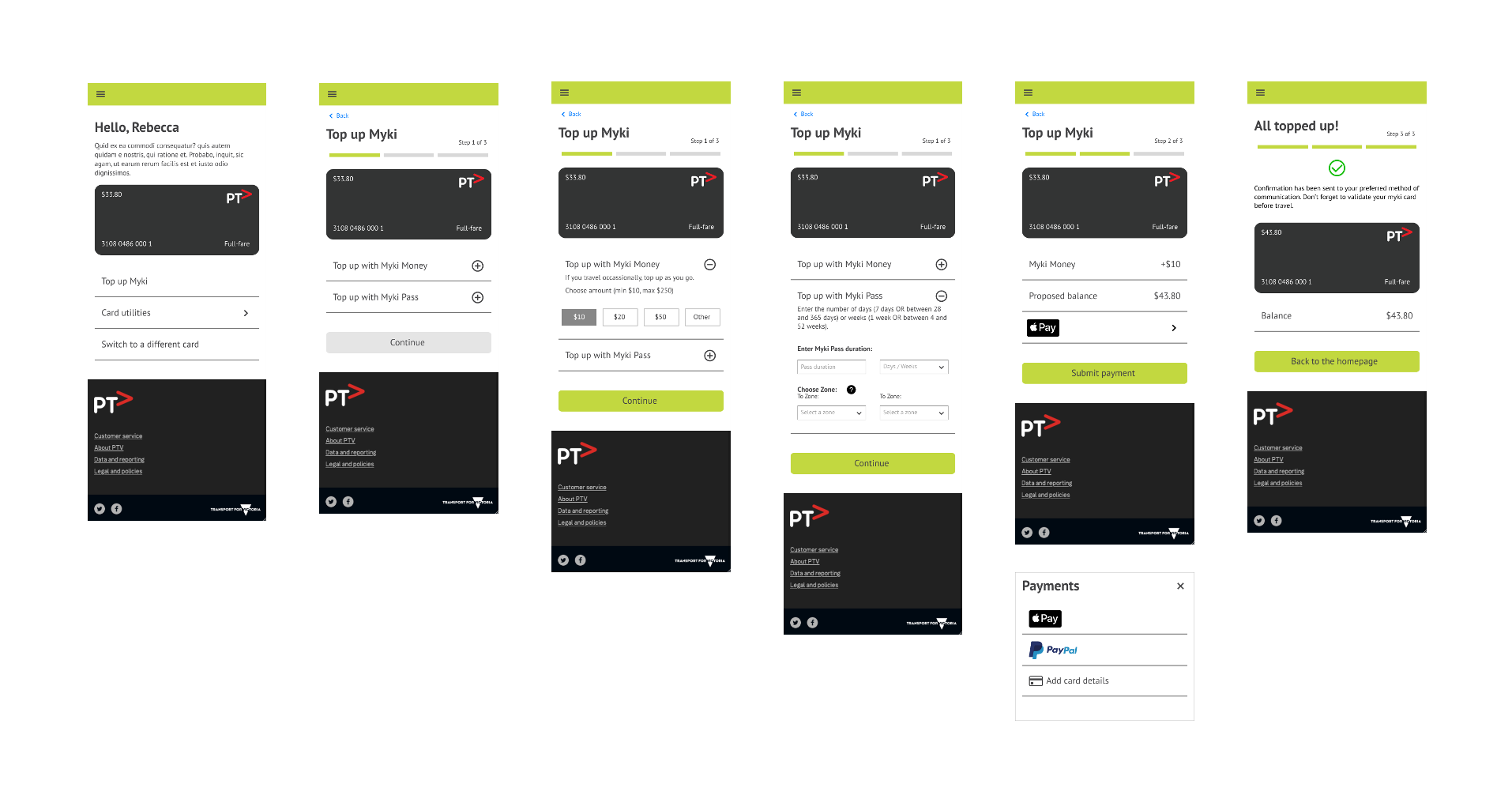
Prototype
Email: afrosthead@gmail.com
© Alex Frost-Head 2021
UX & UI designer